
 Tilda Education
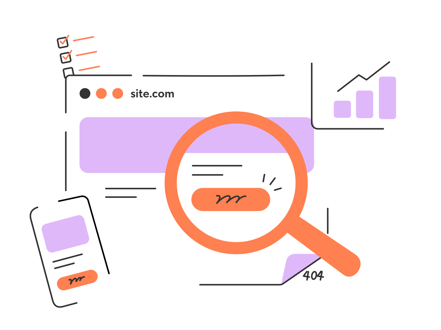
The Website Launch Checklist: 15 Things to Check Before Going Live
A practical checklist of 15 essential things to review before launching your website

Nov. 12, 2026

12 min

Before launching your website, it's important to check a few essentials that affect everything from user experience to search engine indexing. Some steps may vary depending on whether your site was custom-built or created with an all-in-one AI website builder. Either way, this checklist will help you make sure your site is ready to go live.
Contents:
Part I: Setup Checks for Custom-Built Websites

If you've had your website custom-built, this gives you full control over the technical setup. This means there are a couple of extras you need to add to your website launch checklist to make sure that you have the right foundations in place.
1. A reliable hosting plan
Your hosting is responsible for your website's uptime and performance, so it's definitely not something that should be overlooked.
When choosing a web hosting plan, make sure to select a reliable hosting provider. For example, Hostinger offers a range of plans to suit different website needs.

A simple hosting plan will be sufficient for small websites, but if you are expecting seasonal traffic surges, have a complicated website infrastructure, or require additional security measures, you're going to need to look for a more reliable hosting plan before you launch.
2. A custom domain
The domain name you choose will be with you for the long run and forms the identity of your website. As well as picking out a domain that ticks the boxes, you need to make sure that it actually works before you launch.
Firstly, make sure that you've purchased your domain through a reputable registrar. You should be able to log in to your own account to see the domain settings and DNS records. Oftentimes, hosting services like Hostinger also sell domain names. Otherwise, you can choose a common domain registrar like GoDaddy, Namecheap, or Network Solutions.
Secondly, always double-check how long you have registered the domain for. Make sure your contract is set to auto-renew to maintain ownership of the domain. Otherwise, it may expire and become available for someone else to register.
Secondly, always double-check how long you have registered the domain for. Make sure your contract is set to auto-renew to maintain ownership of the domain. Otherwise, it may expire and become available for someone else to register.

Part II: Checks for AI-Built Websites
If you use an AI website builder, it can handle much of the manual technical setup as well as the website creation itself. The main thing to check here is to make sure the service delivers what it promises.
For example, on Tilda, you can use Vibe Block. Simply describe the result you want in a prompt, and AI will generate the corresponding section, effect, or functionality.


Alternatively, you can connect an AI agent like Claude via Tilda's MCP Server and delegate website creation tasks, from building custom layouts in Zero Block to writing posts in Feeds and updating your Product Catalog. You can also share this checklist and a link to your website with an AI agent and ask it to review your website before launch.
Part III: Checks for AIl Types of Websites
3. An SSL certificate
Your SSL certificate is the file that verifies your website's legitimacy and encrypts data to keep personal information safe. Many hosting providers include this as part of their plan, so make sure to check whether this is the case for yours.
Without this in place, any visitor arriving at your site will see a "not secure" warning. This can make your website look unsafe, cause visitors to lose trust in your brand, and drive them away for good.
To check that your SSL certificate is working as it should be, you can click the site information toggle next to the URL in your browser.
Without this in place, any visitor arriving at your site will see a "not secure" warning. This can make your website look unsafe, cause visitors to lose trust in your brand, and drive them away for good.
To check that your SSL certificate is working as it should be, you can click the site information toggle next to the URL in your browser.

4. Fast page load speed
There is nothing more frustrating than arriving at a website and finding yourself staring at the loading spinner. This contributes to your first impression of the site, so it's not something you want your own website visitors to be facing.
If your website isn't loading as quickly as you'd like, further investigation will be required. It could be down to anything from the size of the image files to unnecessary code.
Using Google's PageSpeed Insights tool will let you know how your pages are currently performing and whether there are any suggested improvements that need to be made.
If your website isn't loading as quickly as you'd like, further investigation will be required. It could be down to anything from the size of the image files to unnecessary code.
Using Google's PageSpeed Insights tool will let you know how your pages are currently performing and whether there are any suggested improvements that need to be made.

5. Mobile responsiveness
Nowadays, people are browsing the web on screens of all shapes and sizes. You need to make sure that your website is responsive for people on large desktop computers as well as those on phones and tablets.
One of the key parts of a website launch checklist is checking how your website looks on various devices. You want to make sure that navigation bars, forms, and interactive features are all appearing exactly as they should be.
Many website builders create responsive website designs as standard nowadays, but if you've had your site manually built, it is extra important that you carry out thorough checks.
A good way to do this is through Google's Device Mode. They have a handy guide which runs you through the process, letting you see how your website looks on varying screen sizes.
One of the key parts of a website launch checklist is checking how your website looks on various devices. You want to make sure that navigation bars, forms, and interactive features are all appearing exactly as they should be.
Many website builders create responsive website designs as standard nowadays, but if you've had your site manually built, it is extra important that you carry out thorough checks.
A good way to do this is through Google's Device Mode. They have a handy guide which runs you through the process, letting you see how your website looks on varying screen sizes.

6. On-page SEO optimization
To give your website every chance of being picked up by search engine algorithms and ranking well for your target keywords, there are steps that you should be taking to boost your website's SEO.
Firstly, you should check that every page has a clear heading structure. You need to be using H1, H2, and H3 titles to break up your content and make it clear exactly what the page is about.
You also need to review the metadata for each page. Your page titles and meta descriptions should all be unique and include the keyword you're targeting for each page. This not only helps search engines, but helps you grab the attention of users in search results.
Website builders often include built-in SEO tools. For example, Tilda's SEO Assistant can help you identify indexing issues and get recommendations for each page.
Firstly, you should check that every page has a clear heading structure. You need to be using H1, H2, and H3 titles to break up your content and make it clear exactly what the page is about.
You also need to review the metadata for each page. Your page titles and meta descriptions should all be unique and include the keyword you're targeting for each page. This not only helps search engines, but helps you grab the attention of users in search results.
Website builders often include built-in SEO tools. For example, Tilda's SEO Assistant can help you identify indexing issues and get recommendations for each page.


If you're new to no-code solutions, use this exclusive promo code to get one month of the Tilda Personal Plan instead of the standard 2-week trial.


See instructions on how to activate it
7. Free of 404 errors & broken links
If your website contains pages that search engines are not able to find, such as deleted pages or misspelt URLs, it's going to lead to a 404 error. As well as being annoying for the user experience, it can create confusion for site crawlers.
Before you launch, you want to make sure that your website is free of broken links. To find broken links, errors, and redirects, you can use paid tools like Screaming Frog SEO Spider or free tools like Tilda's Broken Link Checker to prevent potential SEO issues.
As your website grows, some pages may be moved or removed, resulting in 404 errors. Set up a custom 404 page to let visitors know the page is unavailable and guide them to other parts of your website.
Before you launch, you want to make sure that your website is free of broken links. To find broken links, errors, and redirects, you can use paid tools like Screaming Frog SEO Spider or free tools like Tilda's Broken Link Checker to prevent potential SEO issues.
As your website grows, some pages may be moved or removed, resulting in 404 errors. Set up a custom 404 page to let visitors know the page is unavailable and guide them to other parts of your website.

8. An updated privacy policy
Every website owner is legally responsible for disclosing a privacy policy if they are collecting user data. This is in place to explain how said data is collected, stored, and shared.
There are a lot of templates available to give you guidance on what a privacy policy needs to look like, but you need to be sure that your policy accurately reflects your own practices.
When you are running through your website launch checklist, double-check that your privacy policy is easily accessible to users and contains all of the necessary information.
Another thing to note is that if your site is using cookies to track usage, you need to check whether a cookie banner is legally required. Many countries have privacy laws that require users to consent to non-essential cookies being used.
There are a lot of templates available to give you guidance on what a privacy policy needs to look like, but you need to be sure that your policy accurately reflects your own practices.
When you are running through your website launch checklist, double-check that your privacy policy is easily accessible to users and contains all of the necessary information.
Another thing to note is that if your site is using cookies to track usage, you need to check whether a cookie banner is legally required. Many countries have privacy laws that require users to consent to non-essential cookies being used.

9. Clear CTA buttons
When people use your website, the call-to-action (CTA) buttons are what help them get to where they need to be.
These buttons should stand out on a page and have a clear design that makes their purpose known. The wording is just as important, offering you an opportunity to guide users in the right direction through the sales funnel.
During the testing process, make sure you try out each and every CTA button on your site to make sure that they take you where they are meant to.
These buttons should stand out on a page and have a clear design that makes their purpose known. The wording is just as important, offering you an opportunity to guide users in the right direction through the sales funnel.
During the testing process, make sure you try out each and every CTA button on your site to make sure that they take you where they are meant to.

10. Licensed fonts & consistent typography
Before launching your website, make sure you have the right to use all the fonts you've chosen. Font licenses can vary depending on the intended use, and a license for personal or desktop use doesn't necessarily cover embedding fonts on a website.
It's also important to keep typography consistent across your entire website so that it aligns with your style guide and reflects your brand identity. This means using the same font, size, and color for all body text. The same principle applies to headings, image captions, and CTA text.
It's also important to keep typography consistent across your entire website so that it aligns with your style guide and reflects your brand identity. This means using the same font, size, and color for all body text. The same principle applies to headings, image captions, and CTA text.

11. Working forms
Checking forms is a standard part of any website launch checklist, but many people fail to check them as thoroughly as they should.
The first step is to fill out the form and send a test submission, making sure that it arrives in your intended inbox or CMS system.
Even if this looks to be working well, you should go on to test it across different devices. You need to be sure that the mobile version of the form adapts to the smaller screen without hiding any of the labels or buttons.
The first step is to fill out the form and send a test submission, making sure that it arrives in your intended inbox or CMS system.
Even if this looks to be working well, you should go on to test it across different devices. You need to be sure that the mobile version of the form adapts to the smaller screen without hiding any of the labels or buttons.

12. Web analytics
After your website goes live, you want to have access to the analytics right away. This will give you key insights into where people are arriving from, which elements they are engaging with, and whether there are any bottlenecks that need to be fixed. Many website builders now come with their own built-in analytics tools, but Google Analytics is still a popular option for those who are familiar with the interface.

13. Functioning integrations
If you're using third-party integrations across your website, you need to be checking that these are in working order. This might include features such as eCommerce functionality, payment gateways, a booking system, or email marketing automation.
Since these are likely to include crucial aspects of your website, it's going to be problematic if they have not been set up correctly.
Test each of your integrations to make sure that any information collected through the website is pulled through to the system where it should be stored.
Since these are likely to include crucial aspects of your website, it's going to be problematic if they have not been set up correctly.
Test each of your integrations to make sure that any information collected through the website is pulled through to the system where it should be stored.

14. High resolution photos
Since an image is one of the first things a user is likely to see when they arrive on a page, you don't want to launch with poor-quality imagery.
Knowing how to prepare images for publishing online can completely transform how your website looks. They should be high quality, resized to fit the page, and enhanced to match the page’s aesthetic.
You should be checking that the images used across your site are consistent with each other and have been sized correctly.
If you don't have your own images, stock photo libraries offer access to high-quality, licensed images. You can use popular platforms like Unsplash, Pexels, and Pixabay to search for relevant photos, including free options.
Knowing how to prepare images for publishing online can completely transform how your website looks. They should be high quality, resized to fit the page, and enhanced to match the page’s aesthetic.
You should be checking that the images used across your site are consistent with each other and have been sized correctly.
If you don't have your own images, stock photo libraries offer access to high-quality, licensed images. You can use popular platforms like Unsplash, Pexels, and Pixabay to search for relevant photos, including free options.

15. Real user feedback
Before you launch to the public, the most invaluable feedback you can get is going to be from the public themself. This means working with real users who fit your target audience.
By asking them to run through your website launch checklist and flag any usability issues or design elements that they think could be improved, you're getting insights that you may have never considered otherwise.
This step makes sure that you only go ahead and launch once you're absolutely certain that your website is ticking the box for your users.
By asking them to run through your website launch checklist and flag any usability issues or design elements that they think could be improved, you're getting insights that you may have never considered otherwise.
This step makes sure that you only go ahead and launch once you're absolutely certain that your website is ticking the box for your users.

Key Takeaways: Preparing to Go Live After Running Through the Website Launch Checklist
As user expectations grow, the margin for error is small. Since your brand reputation is on the line, you don't want to be clicking the launch button on a website that isn't quite ready.
Jumping the gun and publishing your website before you've carried out thorough checks can be a crucial error. Finding issues with your website once it's already gone live adds an extra layer of stress. Not only are you now having to figure out a quick fix, but you also have the worry of your brand reputation being damaged if users are arriving at a problematic site.
The smaller details are important when launching your new website, which is why those final checks are such a big part of the process.
Once you have run through the website launch checklist and have made sure it is free of errors, you can hit launch with the confidence that your website is ready to go.
Jumping the gun and publishing your website before you've carried out thorough checks can be a crucial error. Finding issues with your website once it's already gone live adds an extra layer of stress. Not only are you now having to figure out a quick fix, but you also have the worry of your brand reputation being damaged if users are arriving at a problematic site.
The smaller details are important when launching your new website, which is why those final checks are such a big part of the process.
Once you have run through the website launch checklist and have made sure it is free of errors, you can hit launch with the confidence that your website is ready to go.


If you liked the article, share it with your friends. Thank you!
Read also:
Free coursebook on how to design, set up, and run
high-conversion landing pages
high-conversion landing pages
All the essentials to effectively promote a website
